
Andrew Christofides: New Work
 It was nice to start the new year off by looking at some art in the Chelsea galleries. It was a last minute decision and I'm glad I did it. I headed over to 25th street, for some reason I always start with this street and can't seem to move past it since by the end of the day I'm already drained from all the art I've seen. This is just one of the many streets in the gallery district.
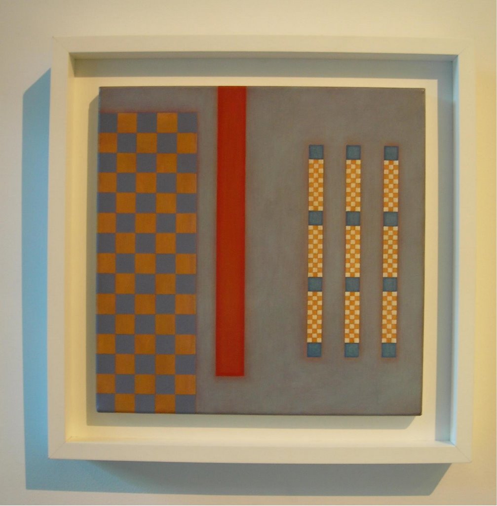
Andrew Christofides, Ruins, 2004, acrylic on canvas, 14 x 14 inches
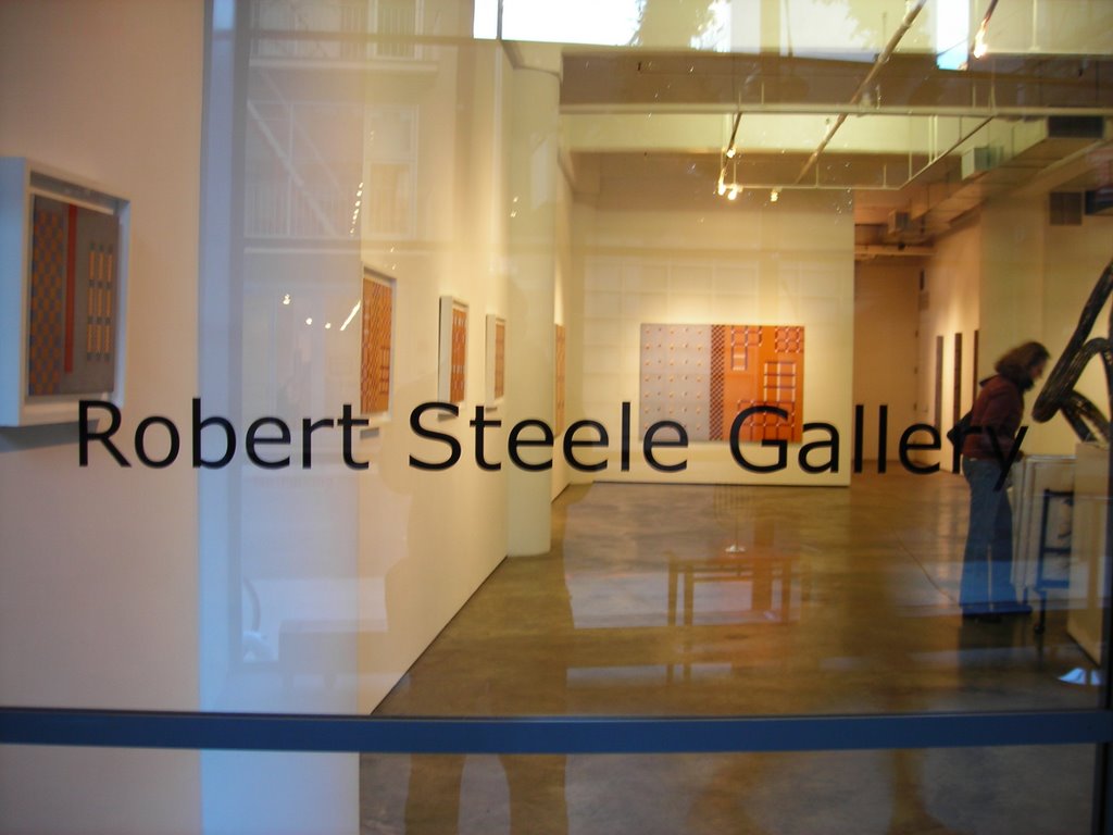
My first stop of the day was the Robert Steele Gallery. I walked into a show of geometric abstract paintings that at first glance didn't seem to do much for me. Colors were muted, yet rich and the compositions were too bare. I gave the work a chance and suddenly I started to feel differently. Looking closely at the paintings one can be surprised by their atmospheric sensibility. Ruins was my introduction to the show and I loved it. I could see the artist's hand at work just by looking at the soft brushstrokes on the surface, which in parts revealed a red undertone. What I liked about the work was its blatant minimalist approach contrasted by organic paint applications. Light plays a big role in Christofides' recent work. Through out the show, small glowing halos surround the small square grids in each painting. Whether or not this was the artist's intention it's still there, and one can't help but to think back to the glowing light of Rothko.

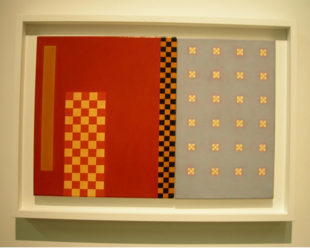
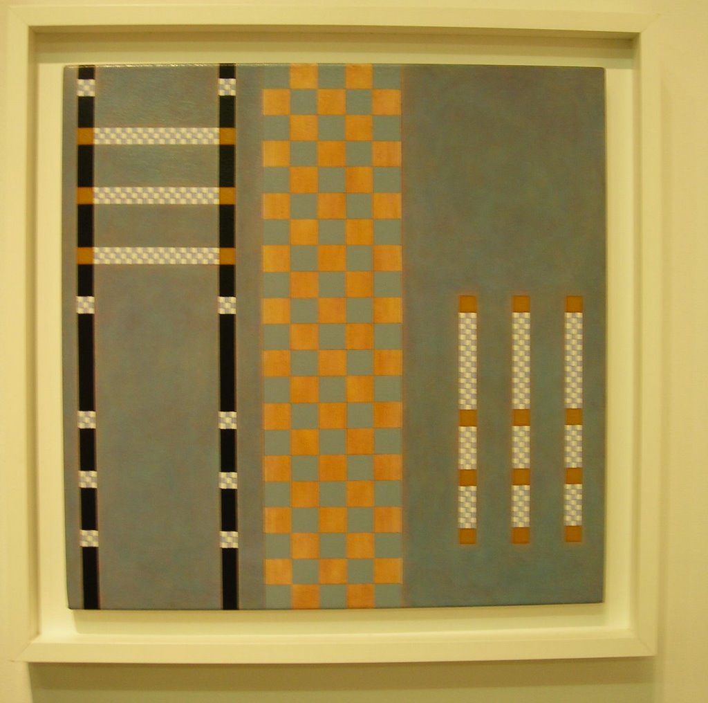
Andrew Christofides, Icon, 2006, acrylic on canvas, 20 x 20 inches
It is apparent that Christofides owes much of his idiom to Mondrian's rigid grid compositions, but in Icon I couldn't help but to see Sean Scully, another abstract painter who works with the grid. It was the use of the earthy rich orange, red and black that reminded me of Scully. The difference with Christofides' work is that the artist keeps his compositions more open, allowing different groupings of grids to seem like they move up and down through out the picture.
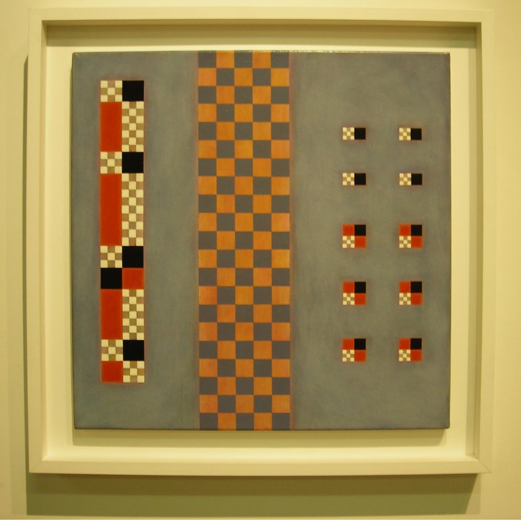
 Andrew Christofides, Optimistic Thoughts, 2005, acrylic on canvas, 16 x 24 inches
Walking towards this painting I felt torn because there was something in it that I thought worked, but I was very bothered by the sharp contrast between the red and blue fields of the painting. I stayed in place trying to understand it, and once again I felt very attracted to the halos around the bright little white grids on the left side of the painting. I thought they looked like little full moons in a summer evening sky, and then it hit me. I started to relate that area of the piece to the full moon in John Singer Sargent's Luxembourg Gardens at Twilight.
 Andrew Christofides, First Ambassador, 2005, acrylic on canvas, 20 x 20 inches
 Andrew Christofides, Olympus, 2003, acrylic on canvas, 20 x 20 inches
The same theme continues through out the show, formalist compositions with touches of light. "Wall decoration" said a gallery visitor with a condescending tone. Are they really? Maybe to a non sensitive eye they are but if you give this work some time you can see the act of painting in them. By seeing the touch of the artist, the energy invested in the work, these paintings start to feel more human.

Andrew Christofides, Reflected Light, 2006, acrylic on canvas, 20 x 20 inches


Comments